Restaurant toolkit
 1min
1min
June 2025

If you think a menu is just a list of dishes with prices, you’re underestimating one of your most powerful sales tools. In 2025, menu design is no longer just about font choices and tempting photos. It’s about guiding the customer journey, reflecting evolving consumer tastes, and integrating with the fast-growing world of digital and contactless payment solutions—like sunday. According to recent research on digital menu trends, over 70% of diners now browse menus online before stepping foot in a restaurant.
Yet, amid this rapid change, it’s surprisingly easy to make seemingly small errors that can undercut sales, confuse guests, or sabotage your image. Let’s dive into the most common mistakes you should steer clear of in your menu design for 2025—and how to fix them.
Offering endless choices might sound like a surefire way to please everyone, but in reality, it can overwhelm diners. A confused mind often picks the safest bet—or orders less to avoid making a “wrong” decision.
Remember, a streamlined menu can be both easier to manage in the kitchen and more profitable overall. You reduce waste and highlight items where you excel.
When diners glance at a menu, their eyes naturally gravitate to certain “sweet spots.” In a physical menu, the top-right corner or center can be prime real estate. In digital menus, the first few items on a scrolling list catch the most attention.
One quick trick: if you’re printing menus, try a small highlight box or signature label for your Chef’s Specials, so they pop out visually.
Ever seen a dish called “Delicious Homemade Grandma’s World-Famous Best-Ever Brownies?” Overly dramatic or vague labels can feel inauthentic. While playful names can be fun, too much fluff alienates customers who just want to know what’s in the dish.
The secret is to highlight what’s actually unique or premium without resorting to hyperbole that customers doubt.
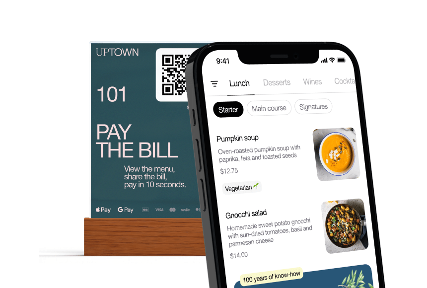
In 2025, your menu likely lives beyond the confines of paper. Guests check it out on your website, on social media, or through an online ordering platform. If your digital presence is inconsistent, glitchy, or incomplete, you’re missing out.
Also, consider how tech like sunday simplifies the overall guest experience—instantly letting diners pay via QR code or browse a dynamic digital menu, ensuring everything’s always up to date.
If your $30 steak appears next to a $15 chicken entrée, diners might think the steak is overpriced, or the chicken is a steal. Pricing is psychological as well as financial.
Always keep an eye on margin and competitor pricing. You want diners to feel they’re getting a fair (if slightly premium) deal—especially if you’re serving top-quality produce or distinctive recipes.
A designer might propose a gorgeous script font or intricate background patterns that look stunning in a portfolio. But in low restaurant lighting, or on a phone screen, that beauty can become a burden.
A visually pleasing design is great—but readability is paramount. Let the visuals enhance, not overshadow, the dining decisions.
Sure, your staff might occasionally pitch an appetizer or dessert, but if your menu itself doesn’t nudge diners, you’re leaving money on the table. A structured approach can systematically boost average checks.
These small prompts can significantly increase your ticket size without feeling heavy-handed.
It’s 2025—vegetarian, vegan, gluten-free, and other dietary preferences are more widespread than ever. If your menu doesn’t reflect these changing tastes, you risk appearing out of touch.
Staying updated on these trends means your menu resonates with evolving consumer priorities and ensures no one feels overlooked.
Menus shouldn’t be static. Basing them solely on your initial launch and never revisiting is a missed chance to reflect what’s actually selling—or what new ideas your chef wants to try.
Frequent mini-updates also keep regulars intrigued, giving them fresh reasons to return to discover new flavors.
You might think your new menu layout is genius. But have you shown it to actual customers? The real-world feedback can be enlightening—if not a bit humbling.
A small test phase can ward off big headaches later. And if you’re introducing a digital version, run it on various phones or tablets to guarantee it looks polished across devices.
Menu design might not get the same hype as a new interior renovation or a fresh social media campaign, but it’s a hidden gem of restaurant strategy. By dodging these common pitfalls—like cluttered item lists, confusing layout, and unbalanced pricing—you’re not just boosting your sales. You’re making the dining experience more intuitive and enjoyable for your customers.
Remember, in 2025 (and beyond), guests are savvier. They research menus online, look for clarity on dietary options, and appreciate easy payment and ordering flows. Tools like sunday fit right in here, letting you keep a dynamic, up-to-date digital menu and simplifying how people settle their bill. That fluid synergy—between well-structured offerings and an effortless checkout—can become a key differentiator, especially in a crowded dining market.
With a bit of planning, creativity, and willingness to adapt, you can dodge these frequent menu design mistakes. The payoff is a smoother, more profitable operation, satisfied diners who find the perfect dish easily, and a reputation for staying current with the latest trends and technologies. So, take a fresh look at that menu. Polishing up your approach now sets you up to thrive in 2025 and whatever comes next in the dynamic world of hospitality.
Drop us your details below and we’ll reach out within the next 24h

With digital menus, you can manage different areas, times, menu types, add-ons, pictures, languages, allergen info and much more.